Refreshing This Little Corner
| Before | After |
|---|---|
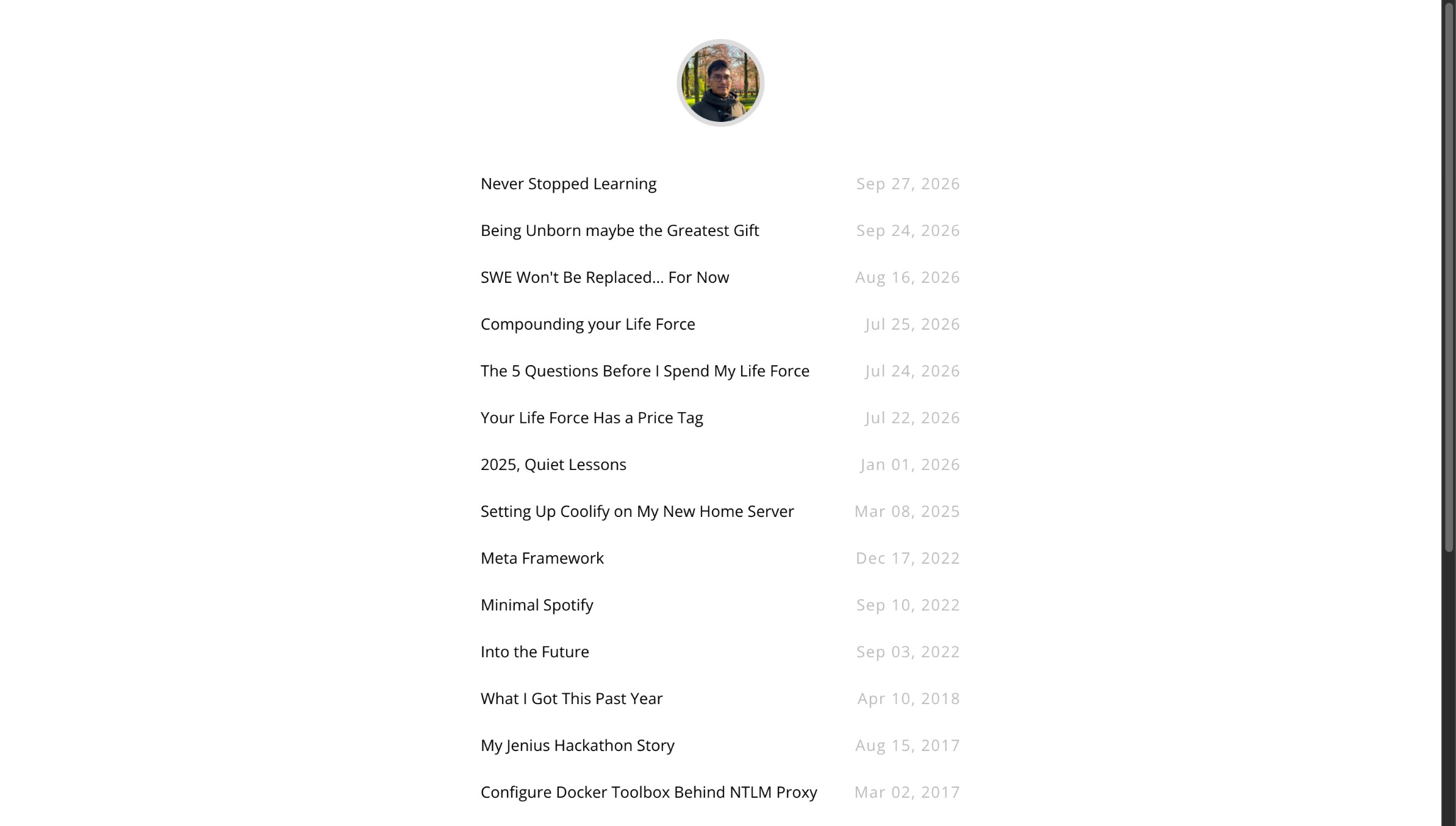 | 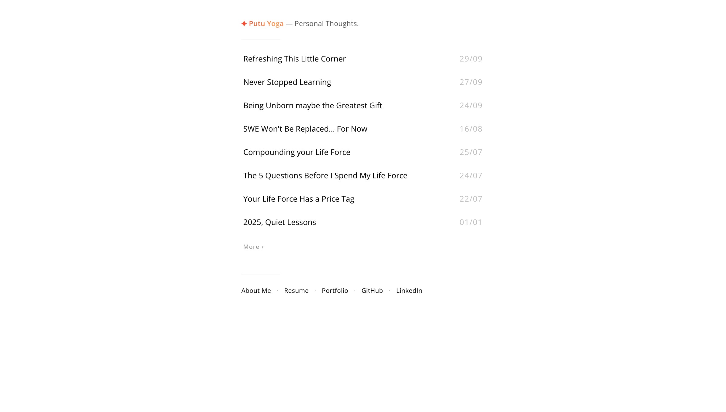 |
I gave this site a small refresh.
The interesting part is that I did not write every line of the implementation myself. I worked with an AI coding assistant: I described what I wanted, it changed the templates and CSS, then I looked at the result, asked for another adjustment, and repeated that loop until the site felt right.
That can make it sound like AI refreshed the site. It did not, at least not by itself. It executed a lot of the work quickly. The direction, the taste, and the final calls still came from the person sitting behind the prompt.
For a small personal site, that difference is easy to see.
This Little Corner Has Changed Before
This site has been around longer than I sometimes remember. In 2015, I wrote a post called “Coba Cobi” about how much I liked the simplicity of GitHub Pages and Jekyll. I started with a fork of a minimal theme, changed the configuration, adjusted some CSS and templates, and discovered that publishing could be as simple as adding a Markdown file to _posts.
That simplicity was the point. I was not trying to build a product. I just wanted a small place on the internet that I could shape myself.
For a few years, it behaved mostly like a durable notebook: posts, small maintenance changes, and not much reason to touch the overall design. In 2022, I did the first broader refresh, adding an English About page and making room for a résumé and portfolio. More recently, a small 2026 update made the site easier to run locally and improved the way posts are browsed.
So this refresh is not a complete reinvention. It is another small adjustment to the same minimal foundation: keep the things that make the site personal, remove the things that get in the way, and make the writing easier to return to.
The Brief Was Not “Make It Pretty”
I did not start with a detailed design system or a Figma file. I started with a feeling: the old site had become a long list of posts with a few things competing for attention. It worked, but it did not quite feel like the place I wanted to keep returning to.
I wanted it to feel more like a notebook for personal thoughts.
That gave the refresh a direction. The front page should introduce the person behind the writing, show a small selection of recent posts, and get out of the way. The archive should make older writing easy to browse by year. Titles, dates, dividers, and navigation should share the same left edge so the page has a clear reading path.
Those are not particularly difficult instructions to implement. The difficult part is deciding that they are the right instructions.
What AI Helped Execute
The assistant was very good at the mechanical work. It updated the Jekyll templates, created the grouped archive, adjusted the post limit, changed date formats, moved the avatar into the About page, and built the footer links. Each small request could turn into a concrete change almost immediately.
But the first answer was rarely the final answer.
At one point the profile picture became too prominent. Then the navigation felt slightly out of alignment with the post list. The “More” link was too loud on the right side, so it moved to the left and became quieter. The footer needed to be useful without becoming a second navigation bar fighting with the page.
None of those corrections came from a syntax error. They came from looking at the result and saying, “this is not the feeling I want.”
That is the part I find most interesting about working with AI. It makes execution cheaper, which means I can explore more options. But it also makes judgment more important, not less. If changing something is easy, it is even easier to keep changing things without a reason.
Product Design Is Still a Judgment Call
Product design is not only about making something attractive. It is deciding what deserves attention, what can stay quiet, and what should disappear entirely.
For this site, I had to decide whether the front page should behave like a portfolio or a reading list. Whether the avatar should introduce every page or only the page that is actually about me. Whether the footer should show practical links or become another place asking for attention. Whether a small animated star adds personality or crosses the line into decoration for decoration’s sake.
An AI can offer a reasonable answer to every one of those questions. It can even explain the trade-offs well. But it does not have to live with the site after the conversation ends. It does not know which version feels like me, which details I will get tired of, or what I want someone to notice first when they arrive here.
That context is still human work.
The Focus From Here
This site is a place for personal thoughts: things I learn while building software, questions about money or time, an opinion I have been turning over for a while, or whatever else I am curious enough to follow properly.
I do not want it to become a content machine or a dashboard for my career. The portfolio and résumé are here because they are useful. They are not the main thing.
The main thing is still the writing.
AI made this refresh faster to execute. It did not replace the reason for doing it. The work was still deciding what to keep, what to remove, and what kind of little corner I want this to be.
That is probably the real lesson for me: AI can make building easier, but a product is not defined by what can be generated. It is defined by what someone chooses to make matter.